
Building a Basic Calculator GUI with Python's Tkinter
This article guides developers through building a basic arithmetic calculator with Python's Tkinter library. It covers setting up the main window, structuring the UI with frames, creating interactive buttons, implementing an output display using `tk.Entry()`, handling user input, and adding a scrollbar for usability. This hands-on approach offers fundamental knowledge for creating Python GUIs.

Building desktop applications often starts with understanding Graphical User Interfaces (GUIs). For Python developers, Tkinter provides a robust, built-in library for creating these visual interfaces without external dependencies. This article guides you through the process of constructing a simple arithmetic calculator using Tkinter, focusing on foundational GUI concepts and practical implementation details. It's an excellent first step for anyone looking to transition from console applications to interactive visual projects.
Setting the Foundation: Prerequisites and Project Vision
Before diving into the code, a solid understanding of basic Python syntax, library imports, and attribute usage is essential. Tkinter comes pre-installed with most Python distributions, but it's always good practice to verify its presence by running python -m tkinter in your command prompt; a specimen window confirms its availability.
Our calculator project is designed to be straightforward yet illustrative. Key features include:
- A complete numeric keypad (0-9).
- Basic arithmetic operators (+, -, /, *, =).
- A non-resizable application window for a consistent user experience.
- An output display to show user input and calculation results.
- An 'AC' (All Clear) button to reset the display.
The user interface will be structured intuitively, resembling a typical physical calculator.
Core UI Construction: Window, Frames, and Widgets
The journey begins with establishing the main application window. Tkinter's tk.Tk() function initializes the root window, and root.mainloop() keeps it active, listening for events until explicitly closed. To give our application a meaningful identity, we use root.title("Calculator") to set the window's title bar text.
python import tkinter as tk
Initialize the main window
root = tk.Tk() root.title("Calculator")
root.mainloop() # This will be added at the very end
For organized widget placement, especially for a grid-like keyboard, tk.Frame() containers are indispensable. Frames allow us to group related widgets, providing a structured approach to layout. In our calculator, we'll use four frames, packed side-by-side using pack(side='left', anchor='n'). The side='left' argument positions frames sequentially from the left edge, ensuring they don't overlap, while anchor='n' (North) aligns their content to the top. This effectively creates columns for our numeric and operator buttons.
python
Create and pack frames for button organization
frame1 = tk.Frame(root) frame1.pack(side='left', anchor='n') frame2 = tk.Frame(root) frame2.pack(side='left', anchor='n') frame3 = tk.Frame(root) frame3.pack(side='left', anchor='n') frame4 = tk.Frame(root) frame4.pack(side='left', anchor='n')
Next, we add the interactive elements: buttons. tk.Button() is the primary widget for this. Parameters like master (parent container), text, font, bg (background), fg (foreground), and activebackground (color when clicked) control its appearance. For consistent button sizing, we employ a tk.PhotoImage object with defined width and height, and set compound="center" to ensure the button's text is centrally aligned over this transparent image. This approach offers pixel-perfect control over button dimensions. Helper functions, buttons for numerals and buttons_ops for operators, streamline button creation with distinct styling.
python pixel = tk.PhotoImage(width=55, height=55)
def buttons(text, frame): button = tk.Button(frame, text=text, font=('Arial', 20), image=pixel, bg="#333300", fg="white", compound="center") return button
def buttons_ops(text, frame, bg, fg): button = tk.Button(frame, text=text, font=('Arial', 20), image=pixel, bg=bg, fg=fg, activebackground="black", compound="center") return button
Example button creation (numeric and some operators)
btn1 = buttons('1',frame1).pack() btn4 = buttons('4', frame1).pack() btn7 = buttons('7', frame1).pack() btn2 = buttons('2', frame2).pack() btn5 = buttons('5', frame2).pack() btn8 = buttons('8', frame2).pack() btn0 = buttons_ops('0', frame2, '#333300', 'white').pack() plus = buttons_ops('+', frame4, 'black', 'white').pack() minus= buttons_ops('-', frame4, 'black', 'white').pack() mul = buttons_ops('x', frame4, 'black', 'white').pack() div = buttons_ops('/', frame4, 'black', 'white').pack() btn3 = buttons('3', frame3).pack() btn6 = buttons('6', frame3).pack() btn9 = buttons('9', frame3).pack()
Above the button grid, we need an output screen. The tk.Entry() widget is ideal for this, providing a single-line text input field. Unlike tk.Text(), which supports multi-line input, Entry fits our requirement for a compact display. It's placed before the frames to appear at the top. Setting state='readonly' initially prevents direct keyboard input, ensuring all interaction comes from our calculator buttons. The pady=(30, 10) argument in pack() provides custom vertical padding, giving more space above than below the entry field.
python
Create the output screen
entry = tk.Entry(root, width=9, font=('Arial', 38, 'bold'), state='readonly') entry.pack(pady=(30, 10))
A useful practice is to define and configure widgets on separate lines from their pack() or grid() calls, especially for widgets you'll interact with dynamically. This avoids the common mistake of assigning None (the return value of pack()) to your widget variable, which can lead to frustrating debugging.
Interactivity: Displaying Input and Scrollability
To make our calculator functional, button presses must reflect on the display. This is achieved by linking a command to each button. The command parameter takes a function to execute when the button is clicked. We use a lambda function, command=lambda:command(text), to pass the specific button's text to a shared handler function.
The command(text) function orchestrates the display update. Because our entry field is readonly, we first temporarily set its state to normal using entry.config(state='normal'). Then, entry.insert(tk.END, text) appends the button's text to the end of the current display content (tk.END represents the end of the text). Finally, we revert the entry's state back to readonly. This ensures a controlled input mechanism.
python def command(text): entry.config(state='normal') entry.insert(tk.END, text) entry.config(state='readonly')
Update button definitions to include the command
def buttons(text, frame): button = tk.Button(frame, text=text, font=('Arial', 20), image=pixel, bg="#333300", fg="white", compound="center", command=lambda :command(text)) return button
def buttons_ops(text, frame, bg, fg): button = tk.Button(frame, text=text, font=('Arial', 20), image=pixel, bg=bg, fg=fg, activebackground="black", compound="center", command=lambda:command(text)) return button
... (rest of the button definitions with updated command parameter) ...
For long calculations, the display might exceed the visible Entry width. To address this, a horizontal tk.Scrollbar() is integrated. It's configured with orient='horizontal' and linked to the entry widget. The entry's xscrollcommand is set to scrollbar.set, allowing the scrollbar to control the view. Conversely, the scrollbar's command is set to entry.xview, enabling the scrollbar to scroll the entry's content. This two-way binding ensures synchronized scrolling.
python scrollbar = tk.Scrollbar(root, orient='horizontal') entry = tk.Entry(root, width=9, font=('Arial', 38, 'bold'), state='readonly', xscrollcommand=scrollbar.set) entry.pack(pady=(30, 10)) # Re-pack entry after defining scrollbar scrollbar.config(command=entry.xview) scrollbar.pack() # Pack the scrollbar below the entry
Finally, to see the window and interact with it, root.mainloop() is called at the end of your script.
Practical Takeaways
This project demonstrates several core Tkinter principles:
- Widget Instantiation: Creating UI elements like windows, frames, buttons, and entry fields.
- Layout Management: Using
pack()withsideandanchorfor flexible positioning. - Event Handling: Connecting button clicks to Python functions using the
commandattribute andlambdaexpressions. - Dynamic Widget Configuration: Modifying widget properties (
state,text) at runtime usingconfig()andinsert(). - Enhancing Usability: Implementing scrollbars for better content visibility.
While this covers the visual and input aspects, a complete calculator would also implement the logic for AC (All Clear) and = (Equals) buttons, handling arithmetic operations, and potentially error conditions. This foundational structure, however, provides a robust starting point for more complex Tkinter applications.
FAQ
Q: Why use tk.Frame() objects instead of directly placing all buttons on the root window?
A: Using tk.Frame() allows for better organization and more flexible layout management. By grouping related widgets (like columns of buttons) within frames, you can apply layout managers (like pack()) to the frames themselves, simplifying complex UI arrangements and making it easier to position elements relative to each other rather than directly on the root window.
Q: What is the purpose of tk.PhotoImage(width=55, height=55) and compound="center" when creating buttons?
A: tk.PhotoImage is used here to create a transparent image of a specific pixel width and height. This object is then assigned to the button's image parameter. The compound="center" attribute tells Tkinter to overlay the button's text directly on top of this image. This combination provides a consistent, pixel-defined size for all buttons, ensuring a uniform look for the calculator's keyboard, irrespective of the text content.
Q: Why do we repeatedly change the entry widget's state from readonly to normal and back when inserting text?
A: The entry widget is initialized with state='readonly' to prevent users from typing directly into the display with their physical keyboard. To programmatically update its content when a calculator button is pressed, its state must temporarily be set to normal. After the entry.insert() operation, setting the state back to readonly immediately re-enforces the input restriction, ensuring that only the application's defined buttons can modify the display.
Related articles
TCG Pocket Responds: A Much-Needed Pace Shift for Pokémon Fans
Pokémon TCG Pocket is rolling out a major update for its second anniversary, primarily addressing player concerns about overwhelming content releases by shifting to a six-week set schedule. This aims to curb player decline and improve overall engagement by giving trainers more time to collect and strategize. The update also adds new collection methods, improved deck-building features, and enhanced trading functionality.
AI's Confidence vs. Formal Methods' Rigor: Design Flaws & Verification
While AI accelerates code generation, formal methods remain critical for ensuring system correctness. Languages like TLA+ and tools like Quint enable developers to model and verify system designs before coding, catching subtle flaws. Quint makes formal methods more accessible with developer-friendly syntax and executability. This approach is vital for verifying AI-generated code through trace validation and model-based testing, ensuring reliability against real-world data.

Ephemeral PR Preview Environments on GKE: A Deep Dive
Every development team eventually grapples with the limitations of shared staging environments. The familiar scenario: multiple features deployed simultaneously, database migrations clashing, and the phrase "it works on

Secure Internal API Access for AI Agents with MCP
AI agents accessing internal APIs directly pose significant risks, including identity loss, unrestricted queries, and security bypasses. The Model Context Protocol (MCP) offers a solution by defining explicit tools. A secure architecture involves an MCP server wrapping the API with strict input validation, coupled with a gateway that handles authentication, rate limiting, and audit logging, ensuring safe and accountable access.
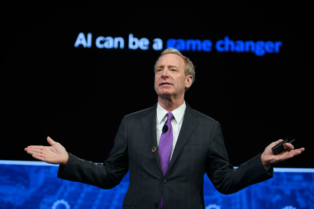
Microsoft president says UK is best placed to drive AI regulation
Microsoft President Brad Smith is advocating for urgent, legally binding AI regulation, arguing that current oversight lags behind basic consumer products. He highlights the UK's AI Security Institute (AISI) and its unique geopolitical position as ideal for leading global safety rules, despite recent US pushback. Smith proposes measures like breach reporting and "kill switches," rejecting voluntary agreements as insufficient.
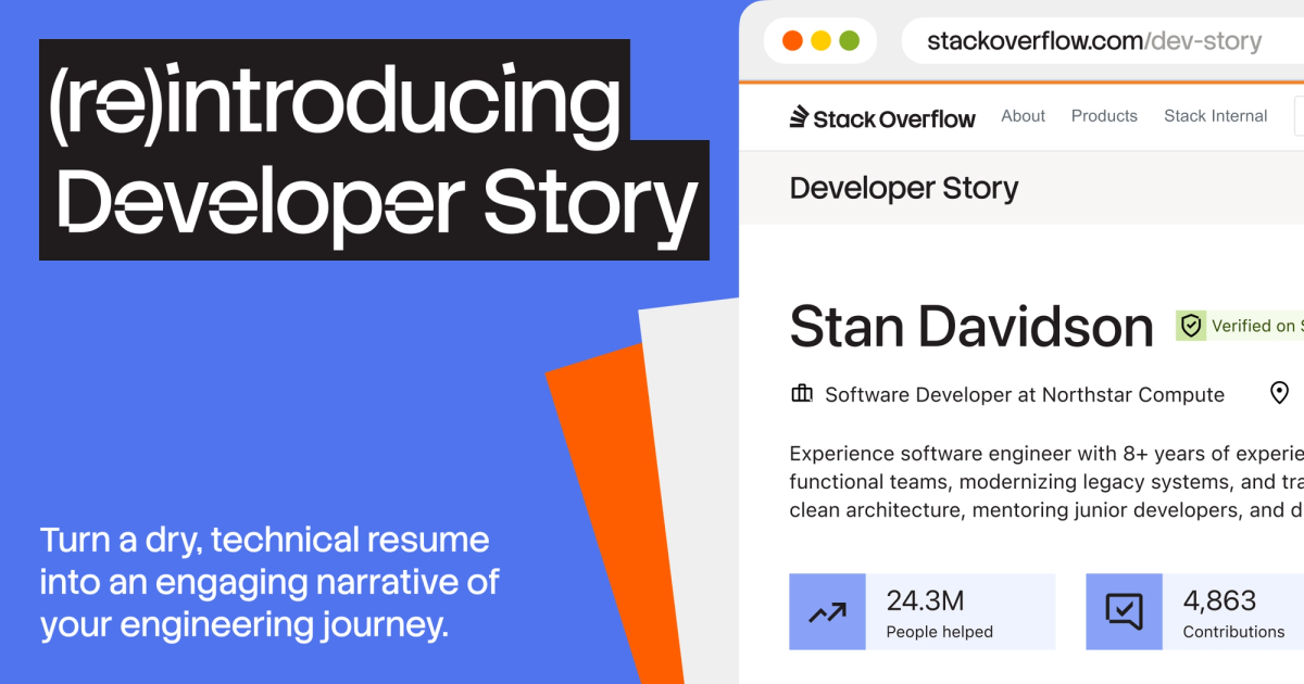
Beyond the Resume Noise: Developer Story Rethinks Tech Hiring
Stack Overflow is addressing the growing challenges in tech hiring, exacerbated by AI's influence leading to untrustworthy and generic resumes. Their solution, the re-introduced Developer Story, offers a platform for developers to authentically showcase their work, expertise, and impact through verifiable contributions and personal projects. This aims to provide hiring teams with more objective insights and help genuine talent stand out in a crowded market.