
Android 17 Logo: A Fun, Evolving Mystery (Spoiled)
Android 17 brought a unique evolving logo across its beta releases, aiming for a fun mystery. While the final Jupiter-like design was prematurely leaked, it's a welcome return to playfulness for the OS.
Traditionally, each new Android iteration receives a distinct logo, often likened to a "mission patch" that encapsulates its identity. Android 15 and Android 16, for instance, each featured their own static emblems. But for Android 17, Google decided to embark on a different, more dynamic path.
<h2>The Evolving Enigma: A Logo in Motion</h2> As testers have been diving into the Android 17 Beta releases, a subtle yet intriguing phenomenon has been unfolding. Unlike its predecessors, the Android 17 logo isn't a fixed image; it's a living, breathing design that morphs and develops with each successive beta release. From Beta 1 through Beta 3, a rudimentary swirl has gradually taken shape, promising to evolve into something more concrete. This iterative design process, shared incrementally with the beta community, has fostered a unique sense of anticipation and curiosity.The subtle nature of this evolution meant that many might have overlooked it initially. However, keen-eyed developers, such as Dylan Roussel on what was formerly Twitter, were quick to notice and highlight this fascinating design choice, even animating the progression to draw wider attention. Roussel’s attempts to predict the final form by manipulating image URLs on Android’s developer site were met with Google’s foresight, as the company actively redirected such attempts back to the latest available version, preserving the mystery. This cat-and-mouse game between developers and Google underscored the deliberate intent behind the evolving logo, intensifying the intrigue for those following its journey.
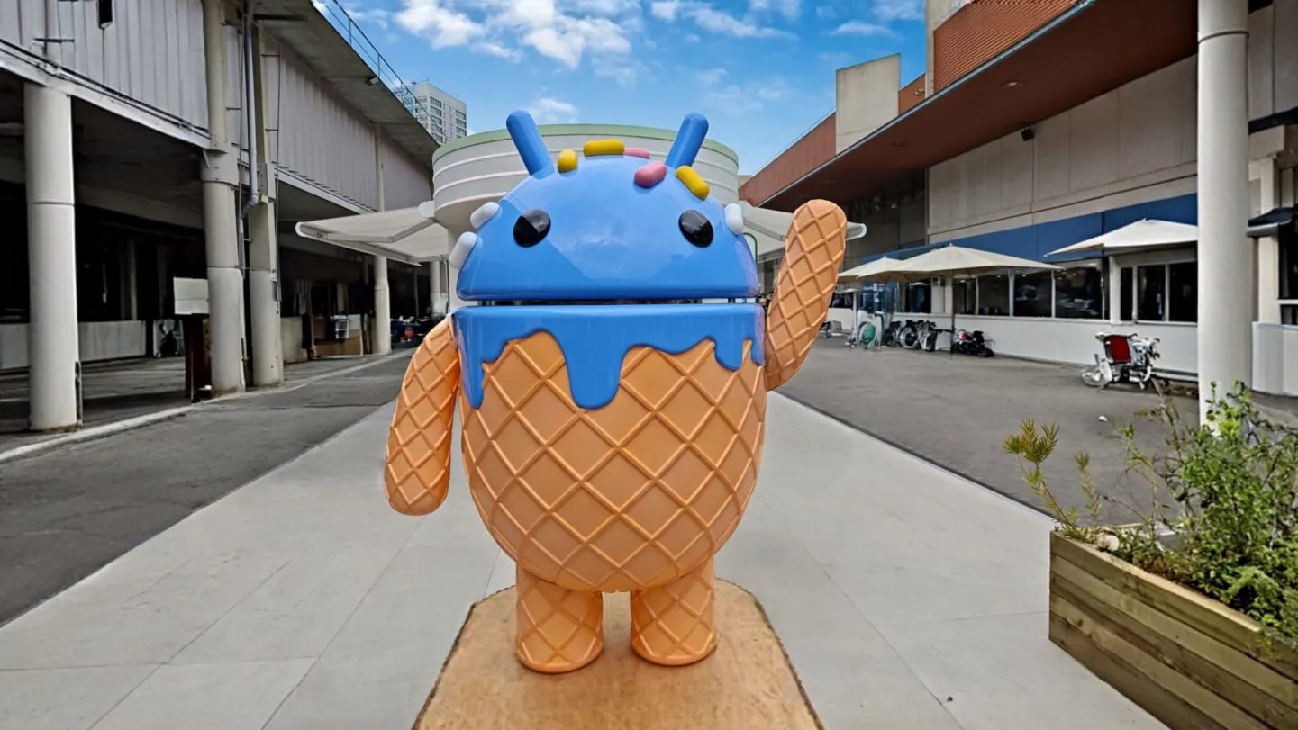
<h2>The Unveiling: Jupiter's Great Red Spot</h2> While Google clearly intended this mystery to unfold over time, a minor misstep meant the final design was revealed ahead of schedule. As is customary, Google provides press materials to publications like Android Authority in preparation for major announcements. For the initial Android 17 Beta 1 release, which was briefly delayed from February 11th to February 13th, these materials included what turned out to be the complete, final version of the logo.This pre-release image, inadvertently included in early press kits, made its way into various Android Authority articles illustrating early Android 17 coverage. And surprisingly, it went largely unnoticed until now that the "final" logo had been publicly visible all along. The ultimate design, now revealed, strongly evokes the iconic imagery of Jupiter and its turbulent Great Red Spot. The swirling patterns that slowly materialized through the beta releases perfectly align with the concept of a massive, dynamic storm taking shape. This celestial interpretation adds another layer of depth and visual interest to Android 17's identity, connecting it to themes of vastness and powerful natural phenomena.
<h2>User Experience & Engagement: A Welcome Return to Playfulness</h2> Despite the early reveal, the concept behind Android 17's evolving logo is undeniably a breath of fresh air. It represents a delightful "fun little mystery" that has been sorely missed in recent Android iterations. In an era where operating systems are increasingly refined and feature-rich, such playful touches can often be sidelined. Google’s decision to infuse a subtle, engaging narrative into a seemingly mundane design element like a logo demonstrates a commendable effort to reconnect with users on a more whimsical level.This approach not only sparks curiosity but also fosters a deeper sense of engagement within the developer and beta testing communities. It transforms a simple branding asset into an interactive experience, rewarding those who pay close attention to the details of each new release. It’s a positive signal that Google might be re-embracing a more user-centric, less purely functional design philosophy, one that values charm and personality alongside raw performance. The communal speculation and discovery around the logo's evolution built a unique camaraderie, proving that even small design choices can significantly enhance the overall user experience.
<h2>The Cracks in the Mystery: A Minor Misstep</h2> Of course, no review would be complete without acknowledging the downsides, however minor they may be here. The primary "con" in this scenario is Google's accidental spoiling of its own carefully crafted mystery. The premature leak of the final logo, while understandable in the rush of a beta release, did somewhat deflate the long-term anticipation. For those who were deeply invested in observing the gradual transformation and guessing the final outcome, the reveal, however it came, ended the suspense earlier than intended.While it's a small detail in the grand scheme of an operating system, the loss of that drawn-out "aha!" moment is a minor disappointment. It highlights the challenges of maintaining secrecy in an age of rapid information sharing and the need for meticulous oversight, especially when cultivating such a deliberate user engagement strategy. However, even with the mystery somewhat "ruined," the core idea and its execution for the most part still stand as a positive creative endeavor.
<h2>Looking Ahead: A Glimmer of Hope for Future Androids</h2> Even if the Android 17 logo mystery concluded sooner than planned, the initiative itself is a resounding success in terms of creative engagement. It serves as a strong indicator that Google is willing to inject more personality and fun back into its flagship mobile OS. We sincerely hope that this isn't a one-off experiment but rather a precedent for future Android releases. Imagine other subtle, evolving design elements, or interactive narratives woven into the operating system’s identity – the possibilities are exciting. <h2>Clear Recommendation</h2> For anyone currently on the Android 17 Beta or considering future updates, we unequivocally recommend embracing and appreciating these playful design choices. While you can't "buy" Android 17, experiencing its evolution, even after the logo's reveal, is a testament to a welcome shift in Google's approach. We strongly encourage Google to continue this strategy of fostering engaging, delightful experiences. These small touches contribute significantly to making Android feel more human, more dynamic, and ultimately, more fun – a feeling many users have been craving. <h2>FAQ</h2>FAQ
Q: What is the significance of the Android 17 logo's evolution?
A: The evolving logo is a playful and engaging design choice by Google, aimed at creating a sense of mystery and anticipation among beta testers. It marks a return to a more fun and whimsical aspect of Android, a departure from the more utilitarian approach seen in some recent iterations.
Q: What does the final Android 17 logo look like?
A: The final Android 17 logo, as revealed by early press materials, strongly resembles Jupiter and its iconic Great Red Spot. The design evokes the imagery of a massive, swirling storm, which aligns with the gradual, tempest-like evolution seen across the beta releases.
Q: Will Google continue this evolving logo strategy for future Android versions?
A: While there's no official confirmation, this review expresses a strong hope that Google will continue this creative and engaging approach in future Android releases. It's seen as a positive step towards re-injecting fun and personality into the operating system, and the community response suggests it's a welcome change.
Related articles

Fourth Wing Book 4: Source Content Insufficient for Review
Quick Verdict/Summary As an experienced tech reviewer committed to honest, detailed analysis, I must report a critical issue: the provided source content for 'Don't Call It Book 4, but the Next Fourth Wing Book Has a

The Motorola Edge 70 Max is all about power: Android — Key Details
Motorola has launched its new flagship, the Edge 70 Max, designed for power users with a massive 7100mAh silicon-carbon battery and 25W Qi2 wireless charging. It’s the first Android phone since the Pixel 10 Pro XL to support full 25W Qi2, surpassing other Qi2-enabled Androids capped at 15W. The device also offers 90W wired charging and a Snapdragon 8 Gen 5 chip.
Best Verizon Plans 2026: Navigating Your Wireless Future
Verizon has been shaking things up, introducing price adjustments and a new 'Simplicity' plan in late 2025 and early 2026. Their approach remains distinct: optional perks allow for customization, but this flexibility

X-Men '97 S2E5 Review: Wolverine's Wild Ride, But What's the Rush
X-Men '97 S2E5: Wolverine's Wild Ride, But What's the Rush? Warning: This review contains full spoilers for X-Men '97 Season 2, Episode 5! It speaks volumes about the creative team behind X-Men '97 that we're already

Alone Australia S4 Access Guide: Mostly Free, VPN Required Abroad
TechRadar's guide on watching Alone Australia S4 is a solid resource, detailing free access for Australians via SBS on Demand and recommending NordVPN for international viewers. While the show is free, a VPN subscription is needed for global access, making the 'free from anywhere' claim slightly nuanced. It offers clear instructions and regional alternatives.

Steve Buscemi Joins Far Cry TV Series, Bringing His Unique Edge
Steve Buscemi is joining the Far Cry TV series in a mystery role, adding significant star power to the upcoming adaptation. He joins a cast that includes Rob Mac and Lizzy Caplan, with Noah Hawley and Mac serving as executive producers. The show will follow the games' anthology format, with each season featuring a new setting and characters, exploring themes of violence and madness. While no release date is set, the series will stream on FX, Hulu, and Disney Plus internationally.